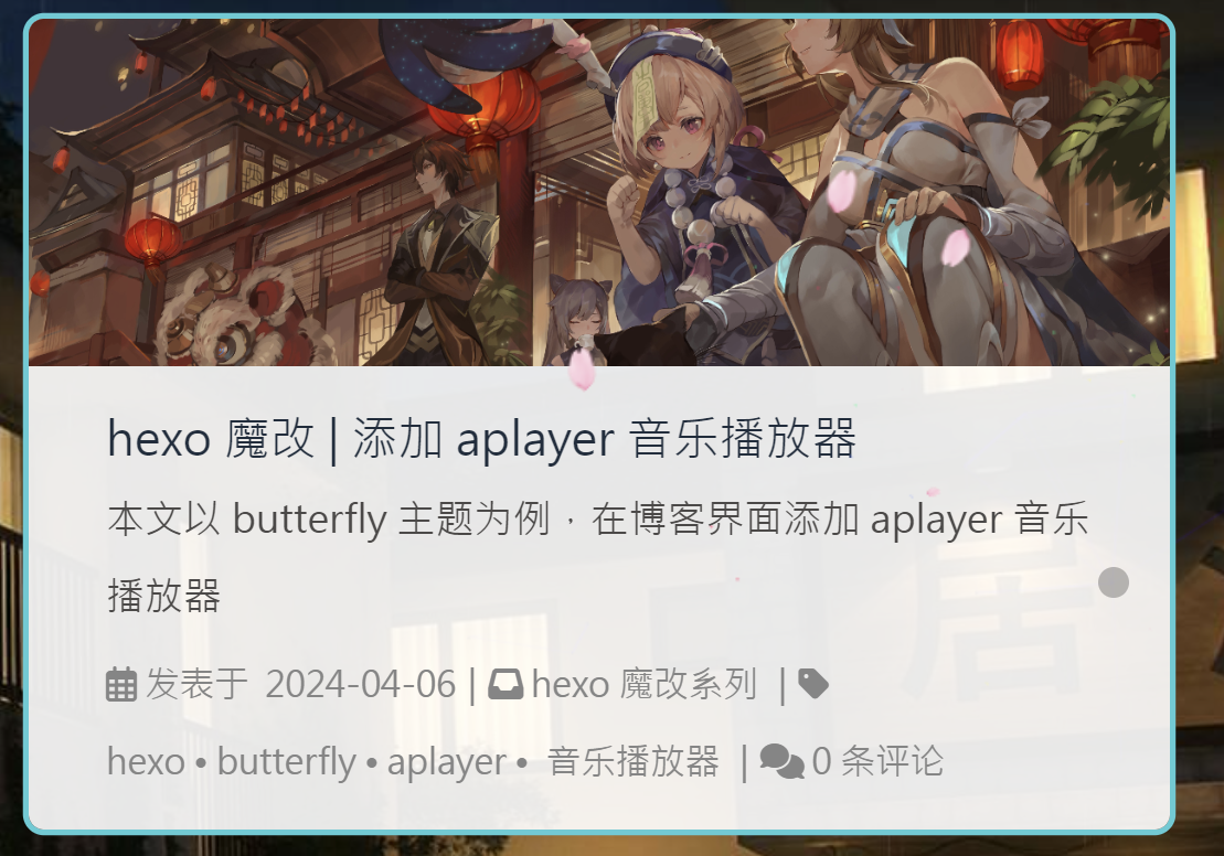
文章卡片效果预览
新建样式
在主题文件夹下 source/css/ 中新建 color.css
1
2
3
4
5
6
7
8
9
10
11
12
13
14
15
16
17
18
19
20
21
22
23
24
25
26
27
28
29
30
31
| .recent-post-item:hover {
box-shadow: 0 0 0 3px #50ccd5 !important;
}
.card-widget.card-info:hover {
box-shadow: 0 0 0 3px #50ccd5 !important;
}
.card-widget.card-announcement:hover {
box-shadow: 0 0 0 3px #50ccd5 !important;
}
.card-widget.card-recent-post:hover {
box-shadow: 0 0 0 3px #50ccd5 !important;
}
.card-widget.card-categories:hover {
box-shadow: 0 0 0 3px #50ccd5 !important;
}
.card-widget.card-tags:hover {
box-shadow: 0 0 0 3px #50ccd5 !important;
}
.card-widget.card-archives:hover {
box-shadow: 0 0 0 3px #50ccd5 !important;
}
.card-widget.card-webinfo:hover {
box-shadow: 0 0 0 3px #50ccd5 !important;
}
|
引入
在主题配置文件中 inject 的 head 下引入 css
1
2
3
4
| inject:
head:
- <link rel="stylesheet" href="/css/color.css">
bottom:
|
侧边栏效果预览

以下的代码笔者均添加到 color.css 中了。
让图片呈现圆角状
1
2
3
| img {
border-radius: 8px;
}
|
添加悬浮效果
1
2
3
4
5
6
7
8
9
10
11
12
13
14
| .aside-list-item:hover {
background-color: #50ccd5;
color: white;
border-radius: 8px;
transform: scale(1.05);
}
.aside-list-item:hover a.title {
color: white !important;
}
.aside-list-item:hover time {
color: white !important;
}
|
添加过渡
1
2
3
4
5
6
| #aside-content .aside-list > .aside-list-item {
transition: background-color 0.3s ease, color 0.3s ease,
border-radius 0.3s ease, transform 0.2s ease, padding-left 0.3s ease,
margin-left 0.3s ease;
padding: 5px 5px !important;
}
|
最终 css 代码
1
2
3
4
5
6
7
8
9
10
11
12
13
14
15
16
17
18
19
20
21
22
23
24
25
26
27
28
29
30
31
32
33
34
35
36
37
38
39
40
41
42
43
44
45
46
47
48
49
50
51
52
53
54
55
56
57
| .recent-post-item:hover {
box-shadow: 0 0 0 3px #50ccd5 !important;
}
.card-widget.card-info:hover {
box-shadow: 0 0 0 3px #50ccd5 !important;
}
.card-widget.card-announcement:hover {
box-shadow: 0 0 0 3px #50ccd5 !important;
}
.card-widget.card-recent-post:hover {
box-shadow: 0 0 0 3px #50ccd5 !important;
}
.card-widget.card-categories:hover {
box-shadow: 0 0 0 3px #50ccd5 !important;
}
.card-widget.card-tags:hover {
box-shadow: 0 0 0 3px #50ccd5 !important;
}
.card-widget.card-archives:hover {
box-shadow: 0 0 0 3px #50ccd5 !important;
}
.card-widget.card-webinfo:hover {
box-shadow: 0 0 0 3px #50ccd5 !important;
}
#aside-content .aside-list > .aside-list-item {
transition: background-color 0.3s ease, color 0.3s ease,
border-radius 0.3s ease, transform 0.2s ease, padding-left 0.3s ease,
margin-left 0.3s ease;
padding: 5px 5px !important;
}
.aside-list-item:hover {
background-color: #50ccd5;
color: white;
border-radius: 8px;
transform: scale(1.05);
}
.aside-list-item:hover a.title {
color: white !important;
}
.aside-list-item:hover time {
color: white !important;
}
img {
    border-radius: 8px;
}
|
最重要的!
别忘了!
1
2
3
4
| hexo clean
hexo g
hexo d
hexo s
|


 wechat
 alipay